Case study
Homepage re-design
for PremiumBeat
Homepage redesign
for PremiumBeat
Homepage redesign
for PremiumBeat
Homepage redesign
for PremiumBeat
Homepage redesign
for PremiumBeat
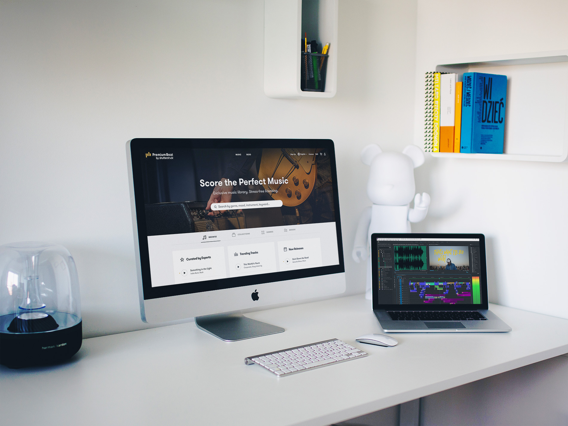
PremiumBeat.com is a curated royalty-free music website that provides exclusive, high-quality tracks for use in new and traditional media projects, including videos, films, apps, games, and television programming.
PremiumBeat.com is a curated royalty-free music website that provides exclusive, high-quality tracks for use in new and traditional media projects, including videos, films, apps, games, and television programming.
PremiumBeat.com is a curated royalty-free music website that provides exclusive, high-quality tracks for use in new and traditional media projects, including videos, films, apps, games, and television programming.
PremiumBeat.com is a curated royalty-free music website that provides exclusive, high-quality tracks for use in new and traditional media projects, including videos, films, apps, games, and television programming.
PremiumBeat.com is a curated royalty-free music website that provides exclusive, high-quality tracks for use in new and traditional media projects, including videos, films, apps, games, and television programming.
Company
PremiumBeat by Shutterstock
Year
2018 - 2019
Role & Responsibilities
Lead Product Designer, ideation, prototype, user test, analyze data, UI/UX, delivery, documentation
Users & audience
PremiumBeat’s customers tend to be freelancers and people who work in smaller production companies or agencies. Most of them have titles like Producer, Director, Video Editor, Art Director, or Creative Director.

What wasn't working?
After launching our new website in 2018, we discovered that our users weren’t scrolling on the homepage, and instead went straight to the search bar or the music page to start their journey. We wanted to create engagement on our front page by providing valuable content.

PremiumBeat's homepage launched in 2018. In the heatmap on the right, visitors were not interacting with the content past the scroll.
The context
The context
A constraint for this project was that this page was used for both logged out and for logged in users, meaning it had to be relevant for new users and returning customers. We also wanted to make sure we were showing at least one music track above the fold.
The solution
A homepage that is both relevant for new and returning customer.
A homepage that is both relevant for new and returning customer.
Step one:
Fast feedback
Step one:
Fast feedback
A first decision with the Product Manager was to gather insight from a first iteration on the homepage in production. With minimal design changes, we re-ordered the content to test if users were more engaged and whether they scrolled to discover the homepage. We moved up the tracklist and changed for a lighter background then moved down our value proposition. We also took the opportunity to add new song collections in between the content. These collections existed through our email lifecycle but were never exposed on our website.
Users were much more engaged with the first tracks featured on the homepage than with the previous version when comparing the new crazyegg recording. Unfortunately, the playlists section wasn't discoverable and only 7% of users would scroll down.
A first iteration to the homepage to gather feedback.
Step two:
Understanding what our users want
After this first learning, I wanted to know if the song collections were relevant, and if so, how much more than Hear it From our Music Experts tracklist at the top? Only 7% of users would scroll to the bottom of the page, but what if it was higher? Even if the new design was more performant, I was curious to dig deeper and uncover new answers.
I thought an A/B test would be relevant to better understand user's goals and thinking.
From here, I designed 2 high-fidelity mockups/prototypes to test against each other. We used usertesting.com for fast feedback without any risk to the business. I wanted to test one design (A) with both content presented as equally important on the page, and a second design (B) where I introduced tabs to navigate through the content. I gathered feedback from a total of 10 participants (5 tested A/B, and 5 tested B/A).
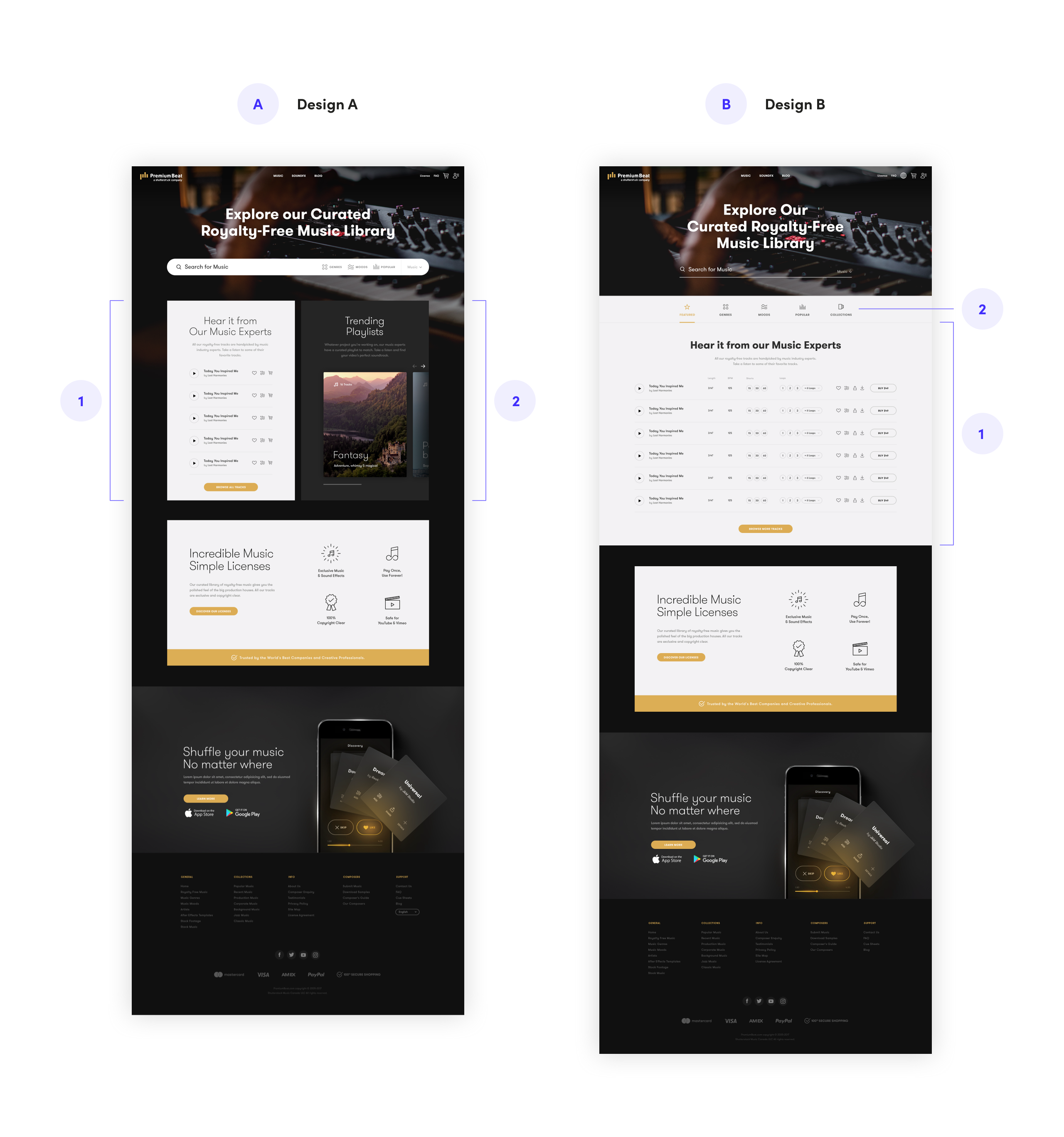
2 high-fidelity mockups used for A/B test.
As a result of this test, there seemed to be no clear winner. Both of them were relevant depending on the context of the user. For example, a first-time user, Hear it from our Music Experts tracks list (1) would be a nice introduction to our music library, and for a returning user, the Collections (2) would be more helpful to find inspiration.
Additionally, the second design (B) was more appealing because it was more interactive with big and clear navigation.
Step three:
Iterate from learnings
After compiling the feedback, I was inspired to create a third prototype (C) that was a mix of designs A and B. I reorganized the content by keeping the tab design from design B and the tracklist design from design A. The tabs with a brighter background brought users' attention and help to keep the content organized.
It felt much better and more intuitive to browse our content. I was able to show more tracks with Curated by Experts tracks (previously Hear it from our Music Experts), New Releases, and Trending Tracks all at once in a simple and minimal view. I learned that the simpler the layout was, the more it was inviting to explore the content.
I also redesigned a simpler search bar by moving Genres, Moods, and Popular tracks into the tabs to avoid any confusion.
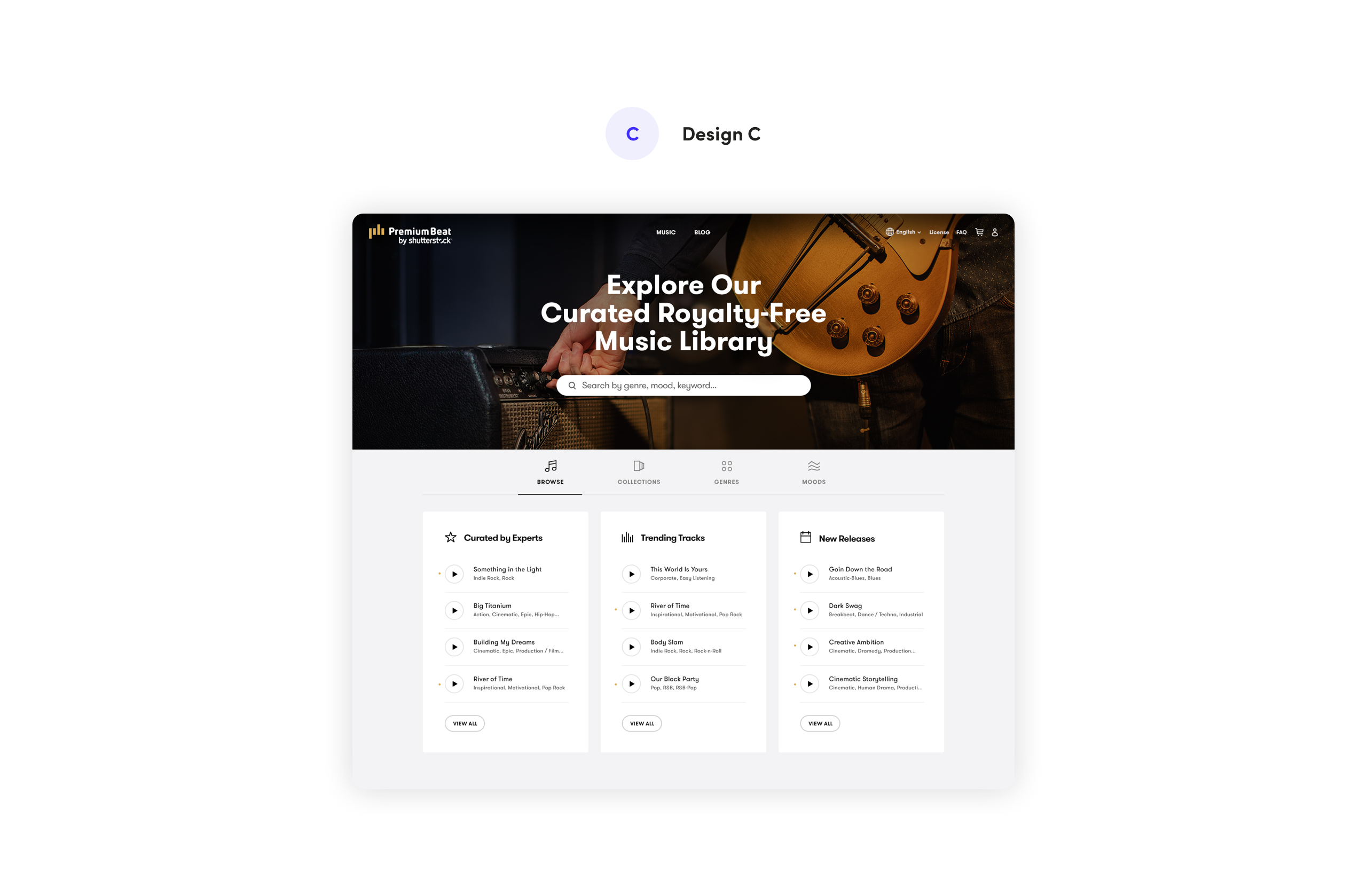
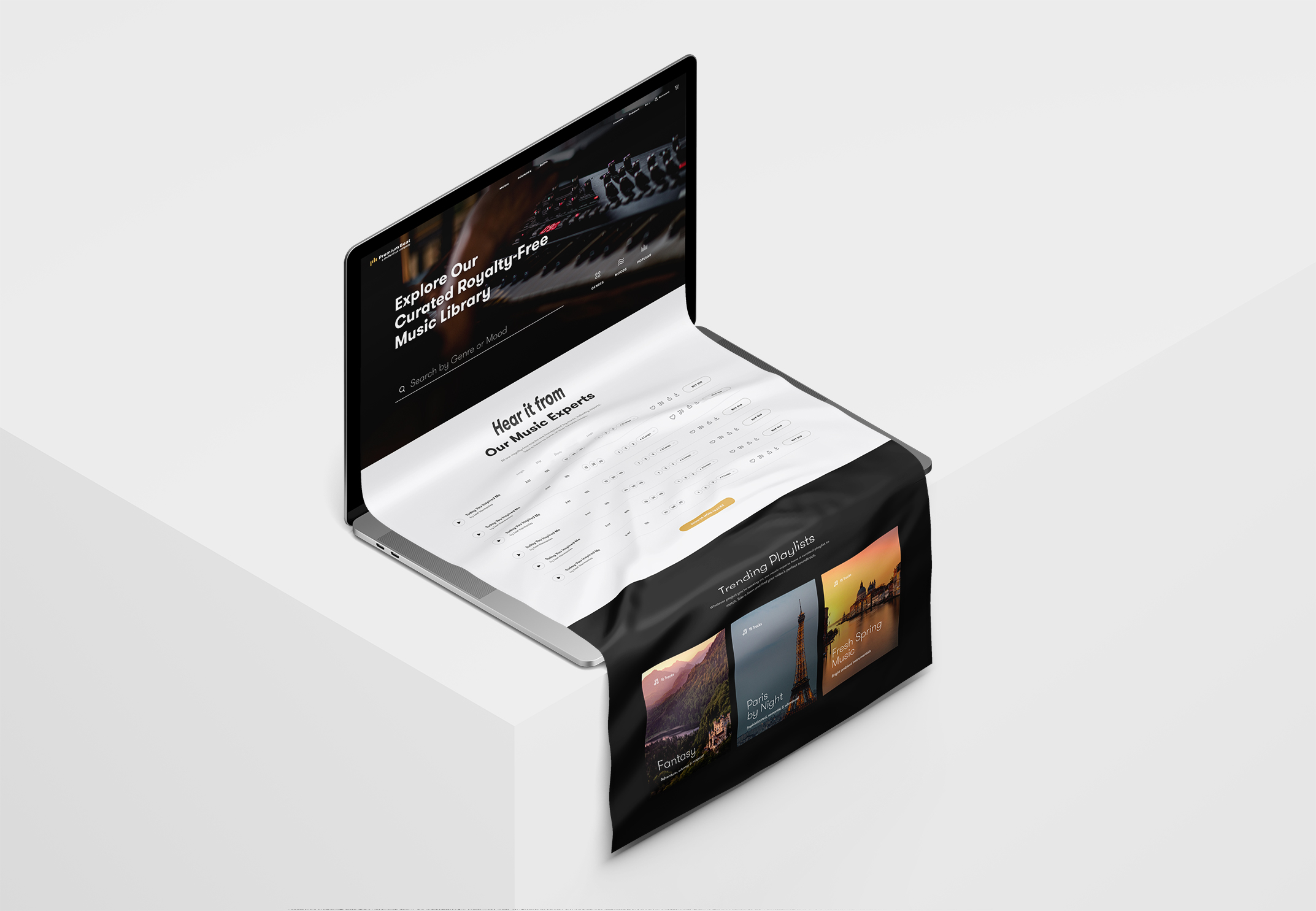
Iterated design from learnings.
Step four:
Validation
I wanted to test a second time to validate my learnings and assumptions. This time, I tested my new design (C) against our current website (D) to understand if I was solving the problem.
From the feedback received, the new design helped direct customers towards the right discovery path through various ways of explorations.
- The new search bar introduced (C.1) was “obvious”, “visible” and “less confusing” than our current one.
- Users seemed to like having three different music lists (C.2) inside the browse tab compared to the full detailed track list (D.2). “It’s a nice introduction to the music library”.
- Collections in the new design (C.3) seemed to be a better way for users to explore content because they were curated. It’s familiar to them because “it looks like other music apps”. “Quick, easy and helpful way to find inspiration and ideas”.
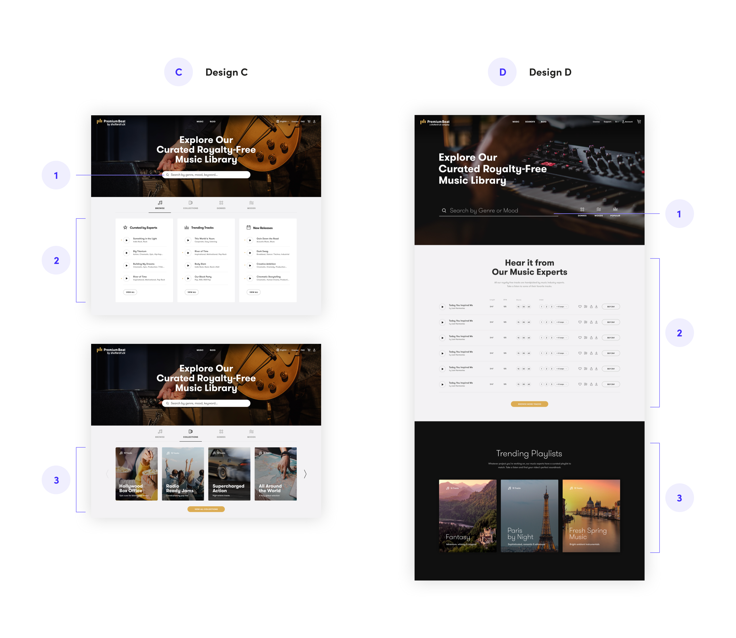
Second A/B testing using a new design against the current website.
Step five:
Light, camera, action!
After sharing my learnings with my team and stakeholders, I received more feedback on my designs. Small adjustments were made to give it a polished feel and ensure a successful launch.
The roll-out plan for this design was to release the hero and the tabs together before introducing new features (during the testing interviews, I've taken to opportunity to test secondary features on the homepage). Following this plan allowed us to still improve the homepage while working on new features and better understand which changes were affecting the business.
We also wanted the collections to be easily managed by our team members using a CMS. In that instance, we developed the page using a CMS where people had limited control over the final design.
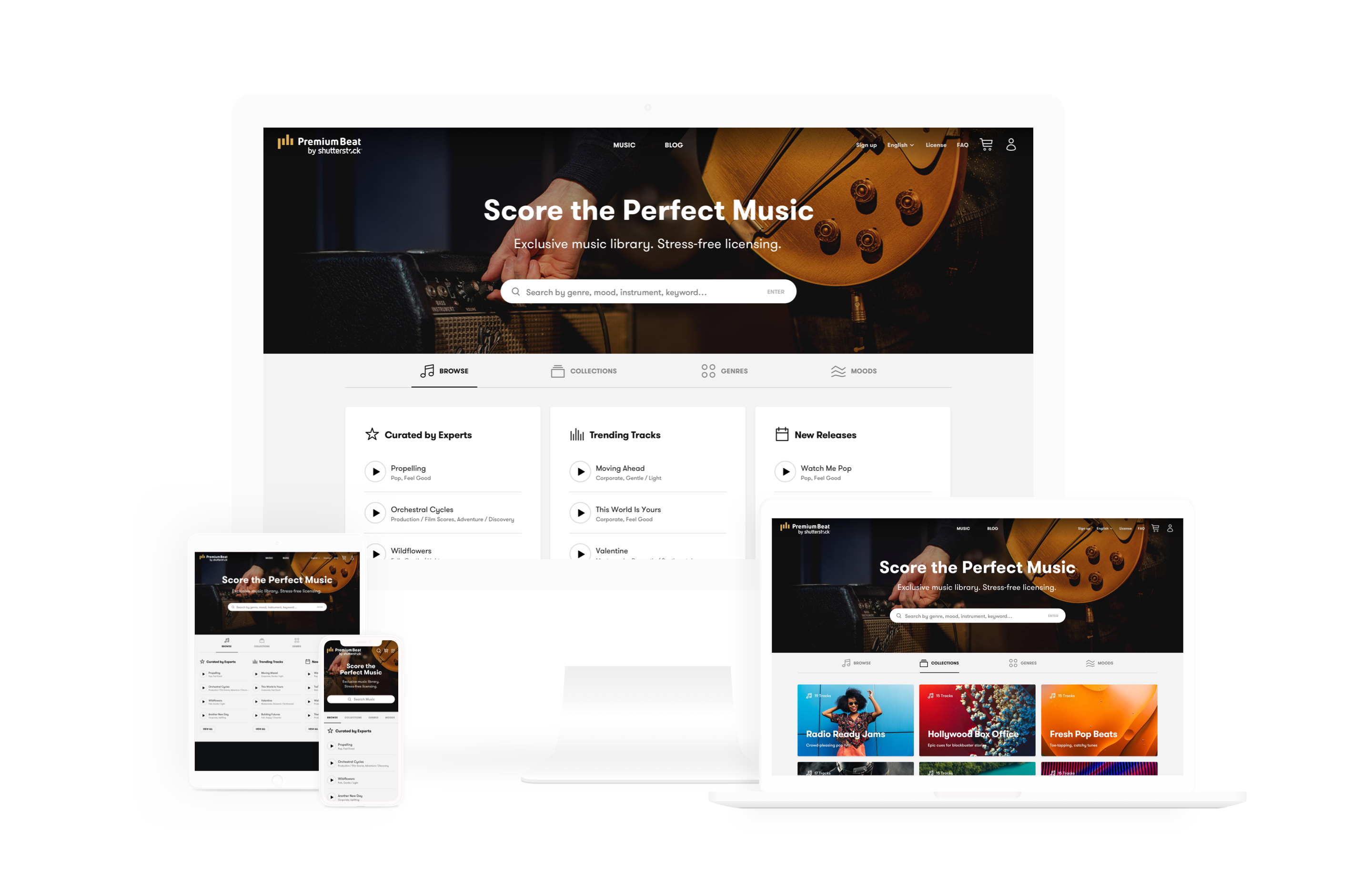
The final design of the homepage in different screen size.
Outcomes & results
Once launched, we immediately started a new crazyegg recording (heatmap) to compare with the old version. After a month, we noticed much more interactions with the tracks on the homepage.
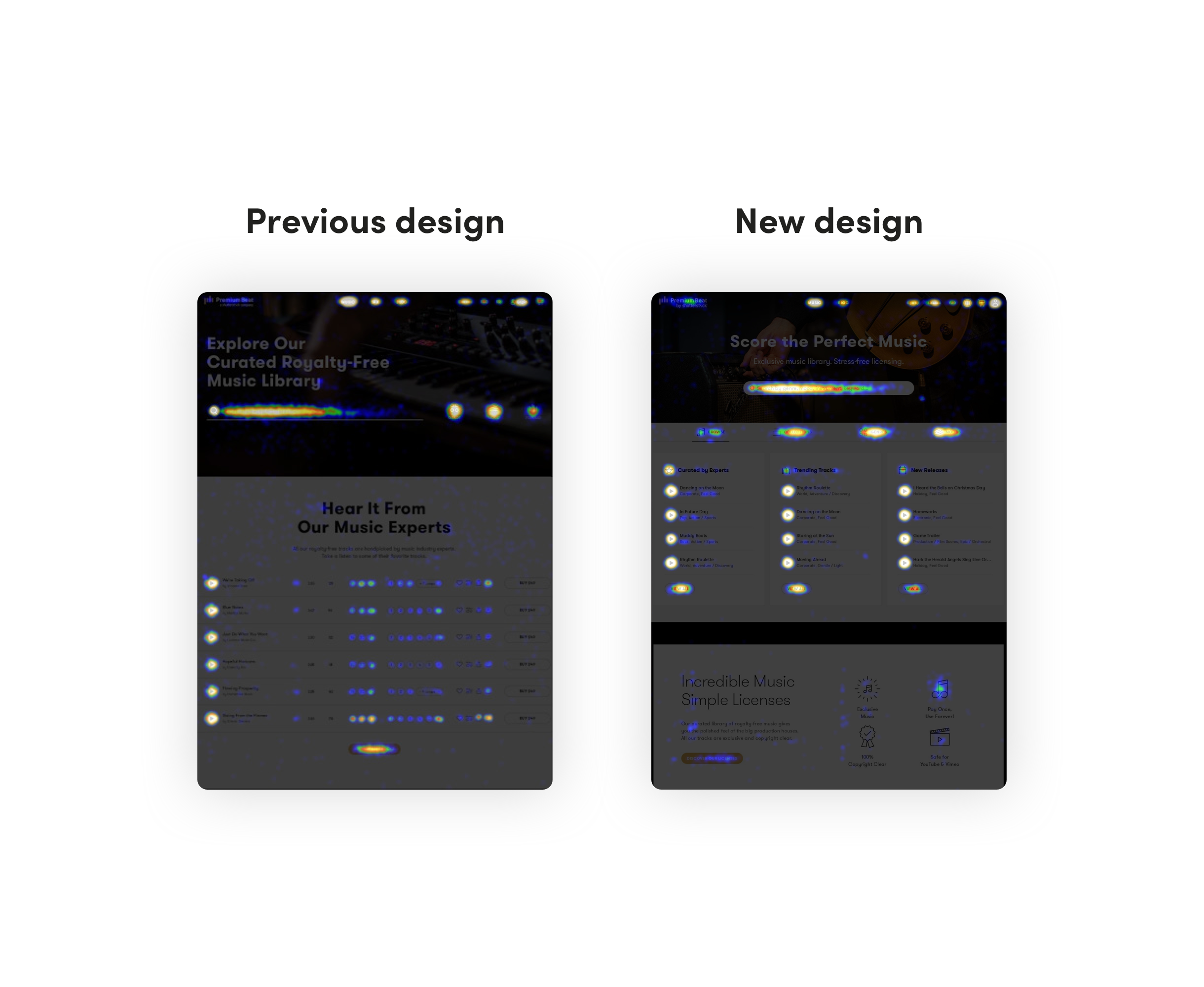
A heatmap comparison between the previous design and the new design.
Unfortunately, we didn’t have click tracking implemented at the time to compare our analytics before and after. We were instead analyzing our conversion rate, traffic and bounce rate from Google Analytics. Along with this new homepage, we released other features in the same month that had an overall positive impact.
The overall result is that these initiatives appear to have increased traffic, eCommerce Conversion Rate, and lowered bounce rate from the homepage. The homepage did improve the bounce rate (11.4%) in the 7-day period it had before other changes went into effect. The eCommerce conversion rate was up (3.08%) among those who saw the new homepage in a 14-day period.
+ 3.08%
+ 3.08%
Conversion rate
- 11.4%
- 11.4%
Bounce rate
Happy with the results, we kept updating our collections while developing some new sections designed for the homepage.
© Naomi Fontaine — Product Designer
© Naomi Fontaine — Product Designer
© Naomi Fontaine — Product Designer
© Naomi Fontaine — Product Designer
© Naomi Fontaine — Product Designer